
2: Births Per Suicide
An International Metric of Hopefulness

Please leave your comments below. My primary goals in this blog are to elicit feedback and make friends who share this interest.
This post proposes a metric for the measurement of hopefulness that extends across many (but not all) countries: Births per Suicide. It’s an odd metric, combining something morbid and tragic with something pure and cuddly. It feels like watching a nature movie (which no-one will ever make) about disgusting diseases infecting adorable furry animals.
Speaking of furry animals, I chose this metric after going down several other rabbit holes, with depression and anxiety rates as one example. But all of those dead-ended with the same problem: inconsistent definitions and inconsistent reporting.
I’ll describe the methodology below, and ask for your theories around causation. But first the results.
Top 10 and Bottom 10
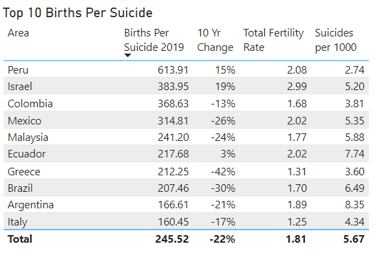
As you can see here, none of the countries with strong Births per Suicide rates have dramatic Total Fertility Rates. Many are below replacement. This is mostly because I’ve excluded countries with high infant mortality for reasons I’ll discuss under the methodology section. But it’s also because many countries with high fertility also have high suicide rates.
You’ll also note that several of these countries have declining Births per Suicide rates. This indicates that suicides are increasing (from a low baseline) or birth rates are declining (from a high baseline). Greece is notable because both are happening at the same time. Ten years ago it would have nearly topped the list.
I won’t offer any theories just yet, because I want to hear your theories first.
Why are these countries so hopeful?

In this chart, you can see that some countries have exceptionally low birth rates, though not all. The Republic of Korea (South Korea) is an interesting and sad case, with both the world’s lowest Total Fertility Rate, and one of the highest suicide rates, and it’s getting worse. The United States and Hungary have nearly-identical Births per Suicide rates, but Hungary is rapidly improving while the United States (as I explained in my previous post) is declining.
Why are these countries so hopeless?
Top 10 and Bottom 10 Change in Rates

Here you’ll notice a number of Eastern European countries with rapidly-improving Births per Suicide rates. Hungary tops the list, rapidly improving from a very low baseline.
You’ll also notice Japan, Russia, and Austria from the Bottom 10 list shared earlier. None of those listed here were on the Top 10 list above (though Israel almost made it with 19%). Does this suggest that it’s easier to improve from a bad position than from a good one?

In this list we see four Spanish-speaking countries but only one English-speaking one.
Similarly to the pattern we found with improving countries, we see that Greece, Brazil, Mexico, Malaysia, and Argentina were all on the Top 10 list but are declining quickly. However, we do see one country from the Bottom 10 list repeated here: the United States; though South Korea (-17%) and Singapore (-15%) almost do.
A kind of equilibrium-seeking force called “adaptation” exists within individual humans, resisting our becoming too happy or too sad and always returning to our genetic baseline. Could something like this exist at the national level, causing countries doing well to decline, and countries doing badly to improve?
Why would the U.S. be the only country on both lists?
Methodology
In crafting this metric and these charts, I had to exclude many countries. In the end, there were 41 remaining.
The primary reason for excluding countries is because of high infant mortality. In countries with high infant mortality, parents tend to have many more kids—not out of hopefulness, but so that someone will survive to take care of them in their old age. As maternal/infant health care improve in countries and infant mortality declines, Total Fertility Rates decline to 2-3 children per woman within a single generation. It’s a striking phenomenon, discussed at length by Hans Rosling in this TED Talk. If you’re someone interested in effective altruism, investing in maternal/infant health care is a great choice.
For this reason, I’ve chosen to exclude countries with infant mortality rates above 1.5%, as well as those whose infant mortality rates were above 3% in 2000 (one generation ago).
The second reason for excluding countries was because of well-known issues with suicide reporting. Countries lacking a widespread health care infrastructure tend to under-report suicide rates, which makes sense. Also—for reasons I don’t fully understand, but which have been noted by others—Muslim-majority countries tend to under-report suicide rates. This is frustrating, because many Muslim countries have low infant mortality, and it would be interesting to explore the influence of their religion on factors like this.
In order to exclude countries who under-report suicide, I excluded those who do not provide detailed data to the Penn World Table project. If this seems like a random way to exclude, it sort-of is. But I found it excludes all of the countries whose data I would have been skeptical of, and not many more.
What Do You Think?
So there you have it. What do you think of this metric and the things it reveals? Why are the rates of Births per Suicide what they are, and why are they changing?
If you can speculate on a reason why, do you know of a reliable cross-national source of data which we could test for correlation?
Within the US there is a surprisingly strong correlation between suicide and elevation. A quick Google search will bring up many papers and articles. I’m not sure what the mechanism is or whether it extends beyond just the US, but it is curious.